Climate Action: Co-benefits and Deprivation
Data Lab Data Visualisation Competition
Last month, the Data Lab closed submissions for their latest Data Visualisation Competition. This year’s competition centred on data behind the UK Co-benefits Atlas. The challenge was “to uncover and visualise a story from the data that has the potential to shift perspectives and influence beliefs”.
Co-benefits are essentially side-effects of action to reduce greenhouse gas emissions. For example, reducing fuel use by reducing car travel might “accidentally” increase physical activity (from, say, cycling to work). Or a move towards more plant-based diets for environmental reasons may also result in a positive impact on health. On the other hand, some co-benefits are not benefits at all. For example, more active travel and public transport might result in longer commute times. The Co-benefits Atlas is built on modelling from the University of Edinburgh, assuming climate action recommended by the Climate Change Committee in its Seventh Carbon Budget. Co-benefits are converted into a monetary value across 45,000 geographical areas covering the whole of the UK. This value is split between 11 different co-benefits (including physical activity increase, dietary improvements, road repairs impact…). The UK Co-benefits Atlas site already has some pretty comprehensive interactive visualisations where users can play around with different areas and combinations of co-benefits.
Luigi Creazzo (my Data Lab mentor) and I collaborated on a joint entry to the competition. Our initial broad idea was to see if we could connect co-benefits related to travel and green space with local government active travel plans and similar initiatives. In particular, we aimed to focus on Fife and Edinburgh as areas we are both familiar with. As it happens, we have both moved house recently, and in the course of house-hunting we’ve used the Scottish Index of Multiple Deprivation, a useful resource that combines socio-economic measures including figures related to income, housing, crime into a single deprivation index. Since both this and the co-benefits data is available at the level of quite small areas, we decided to incorporate the SIMD data to gain insight into how co-benefits are distributed across socio-economic brackets. Perhaps climate-change mitigation actions could help level the playing field. Or will they magnify existing inequalities? To skip to our final entry, click here.
Data
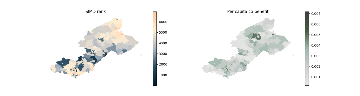
The co-benefit data was provided by the Data Lab, with individual projections for the next 25 years. For our planned static plots, we stuck with the total value across the time period. The SIMD data is easily downloadable in .csv format with a single click from the website. The data from both of these sources uses consistent “small area” or “data zone” codes, which allowed us to merge them and create a single geodataframe with co-benefit figures (including a per-capita calculation), SIMD rank, and shape data. We restricted ourselves to Scotland, for the sake of smaller and more readable maps, not just to be parochial.
We could then plot, for example, a heatmap of total per capita co-benefits, or a heatmap of SIMD ranks. Here they are for Fife.
It would be reasonable to ask whether the projected co-benefits are correlated with socio-economic bracket. From the following scatter plots we can see that there is some relationship, but it is not a straightforward positive correlation. 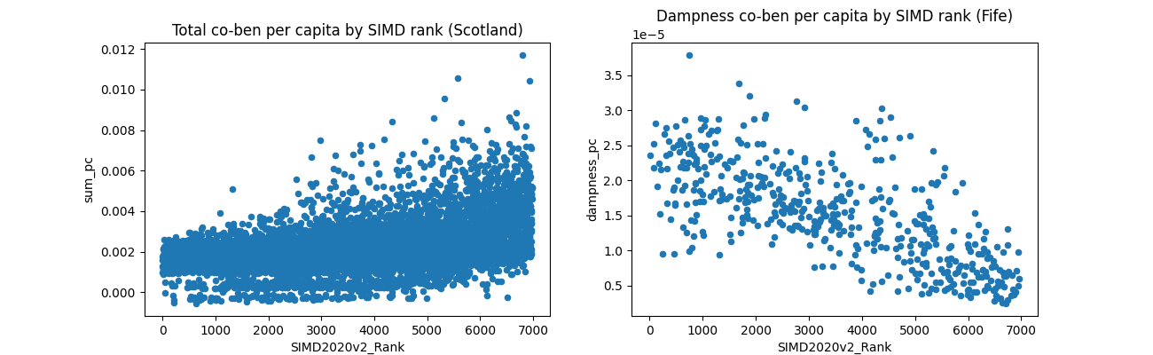 The higher socio-economic bracket an individual is in, the higher the ceiling on their total co-benefit. Note that the minimum possible co-benefit is almost uniform across SIMD ranks. Disaggregating across the 11 different co-benefits is also interesting. For example, in Fife, the dampness co-benefit (that is, benefits from reductions in damp housing, reflected in improved health and wellbeing) seems to be negatively correlated with SIMD rank. This correlation disappears at the Scotland level. Regional effects like this could certainly be interesting to explore more.
To experiment with our code yourself, launch the binder: ![]()
RNIC
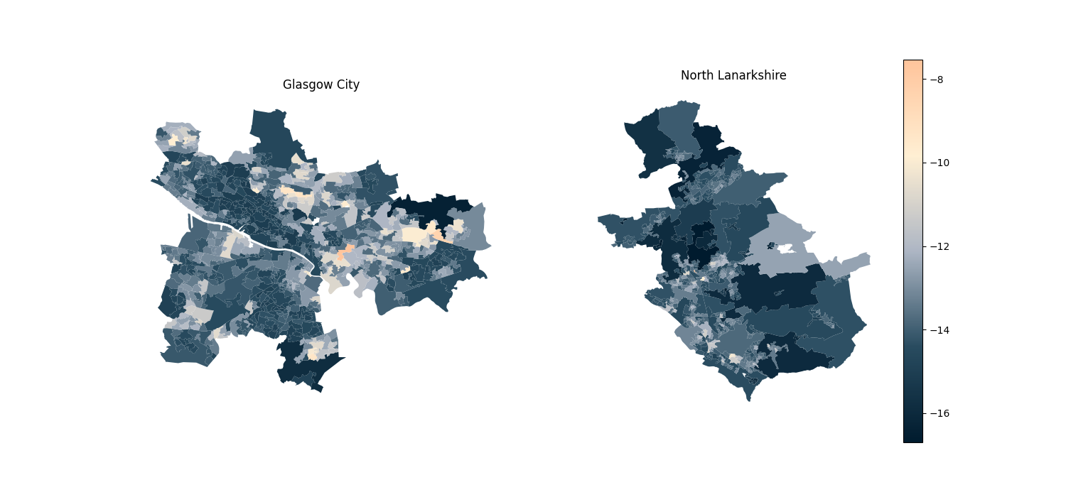
We wanted some way to combine the total per-capita co-benefit value with the SIMD ranking to get a “normalised” co-benefit figure. The idea was to have a qualitative notion of the relative co-benefit to an area, which already takes socio-economic conditions into account, so areas could be compared like-for-like. We settled on simply looking at “co-benefit per SIMD rank”, and defined the Relative Normalised Individual Co-benefit (RNIC) as
\[\mathrm{RNIC} = \log\left(\frac{\text{total per-capita co-benefit}}{\text{SIMD rank}}\right).\]The log was added simply to make the values fall closer to a linear function so that they are more easily comparable, especially on heatmaps. It should be emphasised that RNIC is purely qualitative and not necessarily backed up by strong theory. Nevertheless, it allows us to compare very different regions of Scotland, and what co-benefits climate action might bring. By way of an example, here are RNIC heatmaps for Glasgow and neighbouring North Lanarkshire, indicating that even allowing for differing socio-economic conditions, areas of Glasgow stand to benefit more from climate action. To read a more thorough discussion, see our poster!
Result
We were very happy to be shortlisted as one of the top ten entries! Although in the end we didn’t win a prize, we gave a short presentation and received useful feedback on our work from the judging panel. This was a fun challenge and I want to thank Luigi for suggesting we collaborate on an entry and for all his hard work and ideas. We’re hoping to spend more time expanding the analysis and incorporating the judging feedback into a second version, which will of course be posted here. Watch this space!