GB Onshore Wind
In this post I explore some of the data on onshore wind electricity generation in Great Britain. The goal of this exercise was to practice my python/pandas skills, and data analysis and visualisation more generally. I set out to address the following broad questions.
- How has the energy generated by onshore wind changed in the last 10 years?
- How does it differ between England, Scotland and Wales?
- What are the key factors in determining how much is generated?
A note on the data
I’m using “accredited official statistics” obtained from the gov.uk website, covering renewable energy generation in the time period 2014-2023, and wind data from the archive of the Centre for Environmental Data Analysis (CEDA).
The gov.uk data is regional, and therefore a significant amount of it is suppressed for commercial or security reasons. This factored into my choice to work on offshore wind data: not only does this source of energy represent a significant portion of the renewables output in any given year, but the data is mostly complete. However, it seems that the data for Northern Ireland is very flawed/incomplete, and I am therefore excluding it from the analysis (whence GB instead of UK).
The gov.uk data is in a spreadsheet, which was easily read into pandas. The CEDA archive data comes in NetCDF format, a highly structured self-describing data format which was new to me. Pandas is naturally up to the task of extracting this into dataframes.
Whole of Great Britain
Firstly, lets address question 1. Below is a plot of the total energy generated by onshore windfarms, over the 10 year period in question (according to the gov.uk figures). The general trend is clearly increasing but not monotonically - it does decrease in some years.
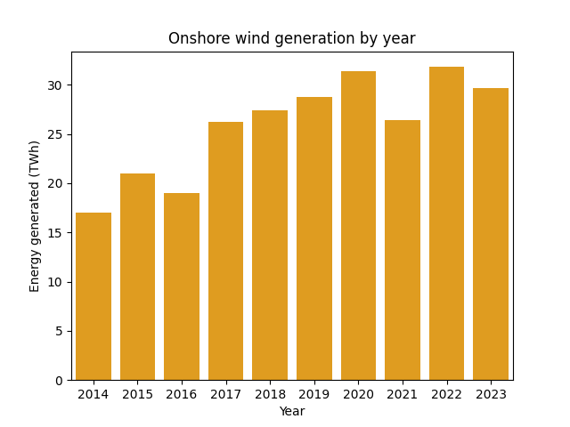
In particular, we have a marked decrease between 2020 and 2021. Clearly, wind energy is at the mercy of the weather. But can an approximately 5 terawatthour decrease be explained by variation in the wind?
Lets replot the yearly generation figures, this time with the yearly average wind speed overlaid (data from CEDA).
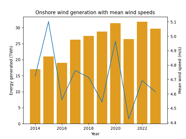
The large drop in 2021 appears to correspond to a drop in average windspeed which is significant, relative to the figures for other years.
Interestingly, wind speed appears to be trending down over the long term. The 10 year period we’re looking at is broadly representative of trend since the late 1960s, as seen in the CEDA data below.
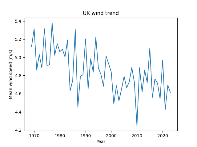
Despite this downward trend, we’re seeing a long-term increase in total energy generated (moderated by yearly fluctuations in wind speed).
By Nation
To address question 2., we’ll look at the respective total energy generated by England, Scotland and Wales.
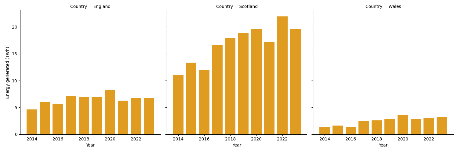
Scotland’s production is far ahead of the other two. What might be driving the differences? Why does Scotland produce so much more?
Firstly, it doesn’t really make sense to compare absolute values since, for example, England is more than 6 times the area of Wales. So lets look at energy generated per square km of land.
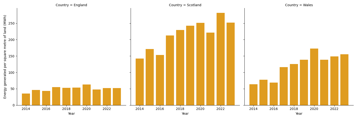
Under this metric, Wales overtakes England into second place, but there is still a clear difference between the three nations. Perhaps there are just more windfarms in Scotland?
The government statistics include the number of sites in each nation, so we can “normalise” by looking at the average generation per site, for each nation. We will also include the wind speed (blue line).
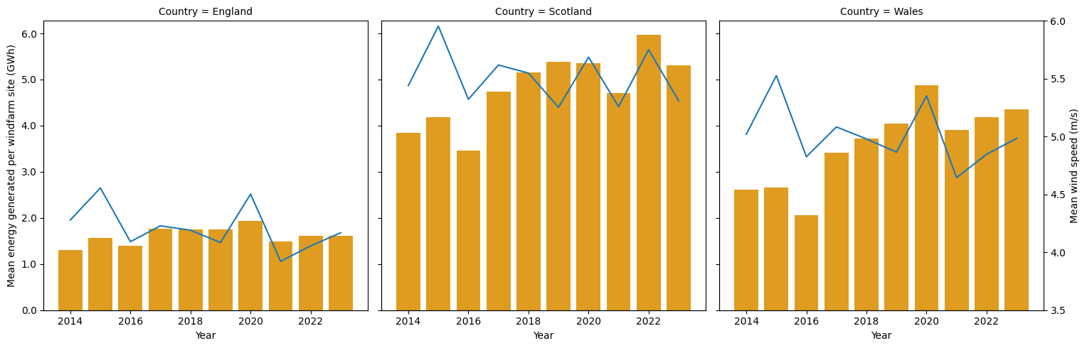
When we account for the number of sites, the differences between the nations become smaller, but still significant. Much more clearly however, the energy generation is closely tracking the average wind speed in each nation, at least from around 2018 onwards. Even when normalising in this way, it still looks like the overall trend is more energy per site, despite the gradual reduction in wind speed as mentioned above. Without looking into it further, this could reasonably be attributed to an increasing size of the average windfarm and/or an improvement in the technology for converting wind to electricity.
So we can hypothesise that average wind speed is a good predictor of energy generation (for an average onshore windfarm). This is not revolutionary but it is nice to see the data reflecting what we might expect.
Coming soon…
The dataset is broken down by Local Authority, so we can test our hypothesis at a much more granular level. Ideally, we could also make this a lot more statistically rigorous.
I intend to make the code public too in due course.